Code mapping (HCCI) tool
Simplifying the user journey for Bupa ANZ’s claims assessors to enable them to process customer hospital claims more accurately and efficiently.
24/11/2024 – 8 minute read
The challenge
The Problem
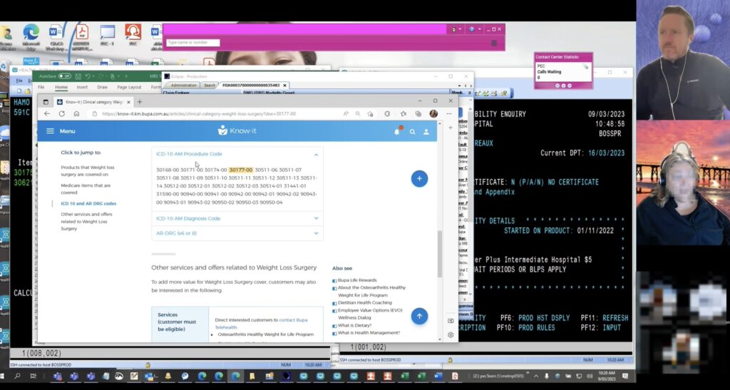
Know-it is Bupa ANZ’s established and trusted product and policy knowledge-base for it’s front line staff when they are assisting customers with enquiries. However, when it comes to assessing hospital claims for individual customers, it’s user experience falls well short of user’s expectations as this process is very time consuming, labor intensive and often has a low degree of accuracy.
The solution
We set out to overhaul the code mapping process by building a dedicated self service tool which simplified finding the eligibility of hospital claim items for individual customers by making fewer steps and obstacles for our users, so they could process these claims more efficiently.
My Role
As the Senior UX Designer of the Smart Response team, I led the research and visual design phases of this project and worked closely with our Product Manager, the Data Team, Smart Response’s development team as well as senior Bupa stakeholders for this high priority project.

“…it doesn’t cater to our needs, we have to search everywhere to find a small piece of information…”
AARON, claims assessor
TL;DR Version / Summary
Problem:
Users are having difficulty code mapping hospital claim numbers.
Solution:
Design a self serve code lookup tool
Tasks:
User interviews & summary report
Usability tests
User flows/IA
Stakeholder workshops
Lo-fi prototype
Hi-fi interactive prototype
Outcome:
30% daily increase in claims assessed, saving $12,500 per agent per week.
User research
User interviews:
I conducted and led 10 interviews in Microsoft Teams with Bupa ANZ front line staff to develop a better understanding of how they currently approached the code mapping process while using Know it.
These interviewees came from different teams across Bupa ANZ such as Retail, Contact Centre, Messaging and Claims Assessment.
Typically these users:
• Valued easy navigation and speed
• Used at least 4 other programs to perform their daily role other than Know-it
• Had an average tenure of 4 years at Bupa, with 50% being their for >1 year

User interview summary findings:
Search
Users felt like Know-it didn’t work for them, often the search feature would not bring up the desired result
Navigation
Users often had to sift through large numbers of searches and articles to find claim items
Ambiguity
Identical claim codes could appear on multiple pages and often with differing or multiple answers
Lack of context
There was little to no context about item numbers within policy or product pages in regards to the users specific claim enquiry
Wayfinding
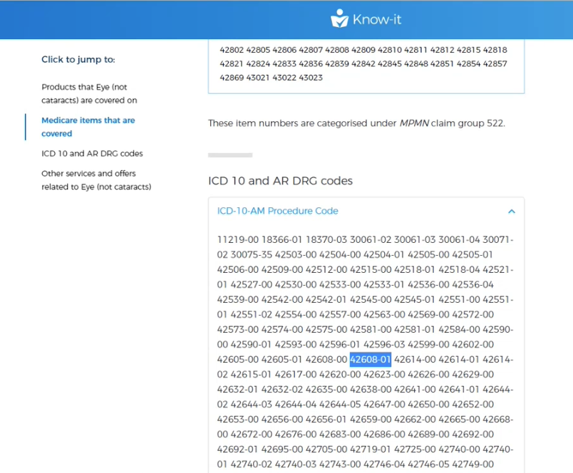
This was difficult as some codes where listed amongst 30-50 other claim numbers on certain pages within Know-it
No central system
Users had to go through a process of elimination across many articles/pages to find the relevant clinical category items.
Common insights
Pain points in a nutshell:
Most users found that Know-it’s code mapping process was not exact enough.
A common story from our users was that they would have to go to multiple pages that contained the claim code and in many cases, this number would be listed among large paragraphs of other numbers which was hard for users to find and often this number had no context of the customer’s healthcare level of cover.
In many instances, the user would have repeat this step numerous times to find the right number and once they actually found the number, they would then have to search for the customer’s current product information and cross reference the two pieces of information.
User flows
The strong feedback that we received in the interview process was that the code mapping process was very confusing and that a lot of trial and error was required to find claim item eligibility and even then, there was low confidence from our users that their search was correct.
So the best way for us to start was to analyse the current state user flow.
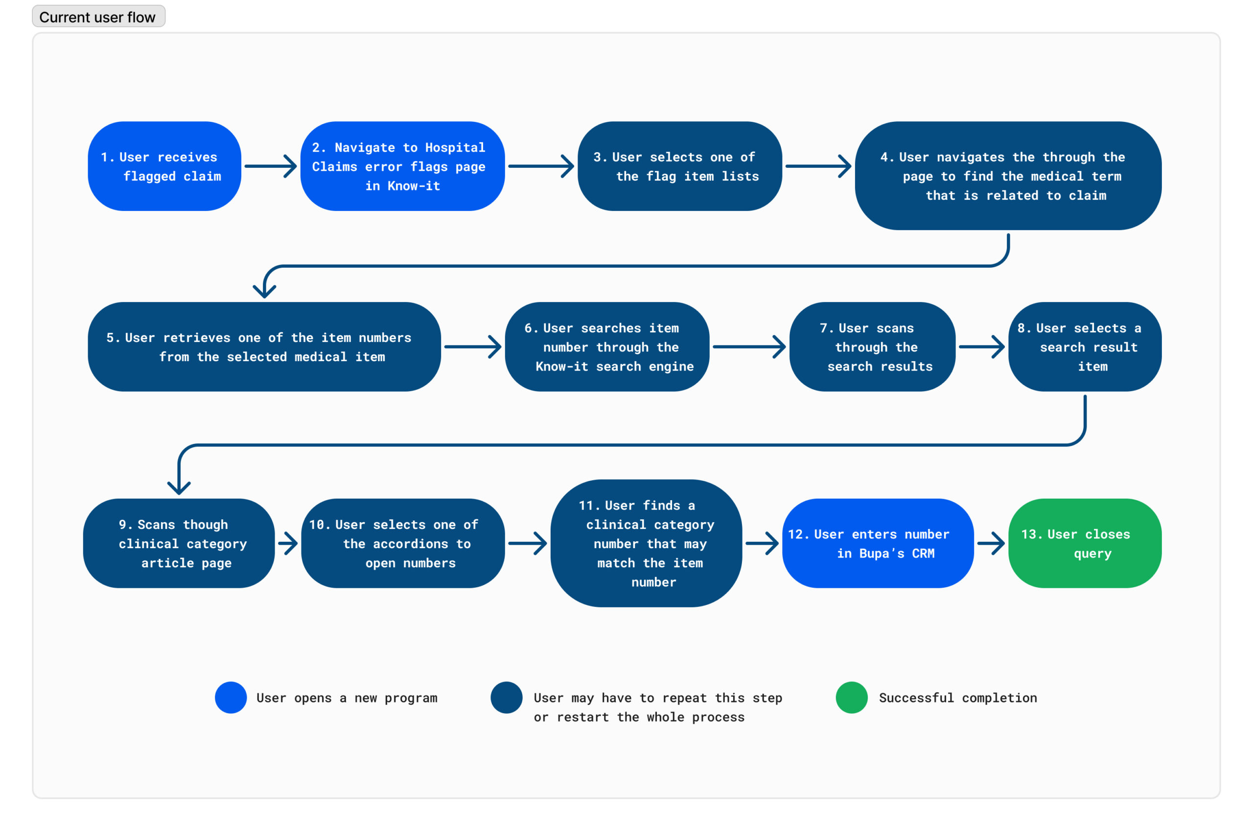
Please note: This is the process to find just one clinical category number match against one claim item.
If there are 4 claim items within a claim, then this process has to be done 4 times.
Looking at this process, it was apparent that users would often have a low yield from their search query and would often have to start and then restart the process of matching the item numbers to the claim codes, there was no certainty that the search would be successful which resulted in a low confidence in the time consuming process.
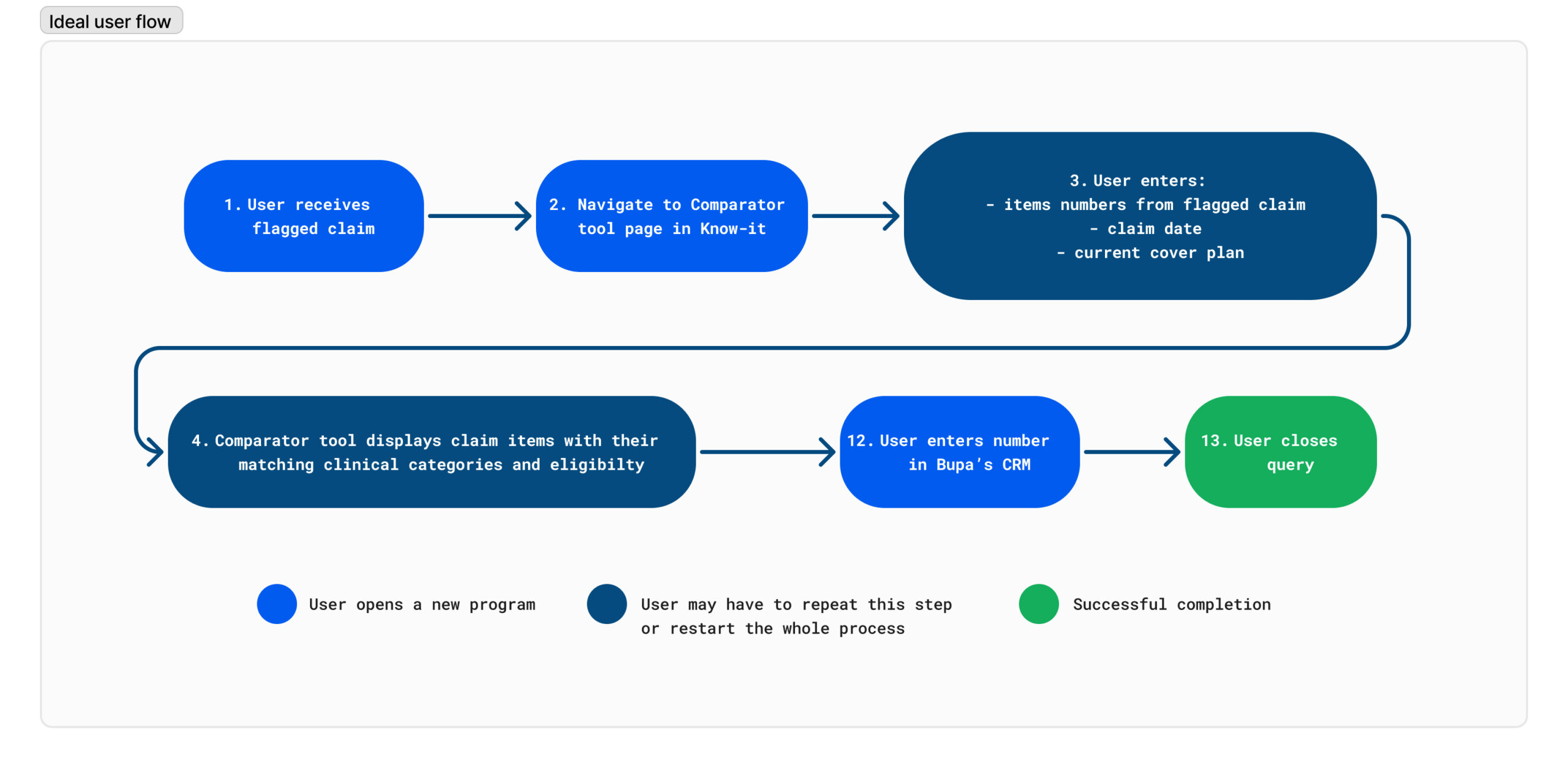
Recommendations for a future state user flow:
After my interview findings, I recommended that updated code mapping tool would have the following improvements
- One page, self serve tool
Users shouldn’t have to search across multiple pages for a specific number - Specific search and filtering
The current state Know-it search feature is too broad, let’s focus on using the hospital codes to initiate the code mapping process rather than make the user search for them - Match the code with the product
Bring the hospital codes and the customer’s product cover together in the one place, rather than working between them in separate, content heavy articles. - Show a hospital’s claim item’ eligibility immediately
Let’s give them the answer straight away and make the eligibility status obvious
From these recommendations, I proposed a simpler user flow in which the user could self serve by entering the claim item numbers up front and then check for the claim item eligibilty .
Stakeholder workshop:
After consulting a Bupa ANZ CRM data team in a feasibility session (that also included the SmartResponse team) and presentation the user flow proposal, we were able to confirm from them that it was feasible for the hospital claim data and all of it’s child items to be surfaced online in real time. This was a crucial stage as it allowed us to mostly follow the proposed user flow, it also gave us the chance to open discussion on other data which could be surfaced – which was valuable information to receive before the design stage.
Design stage
Lo-fi prototypes
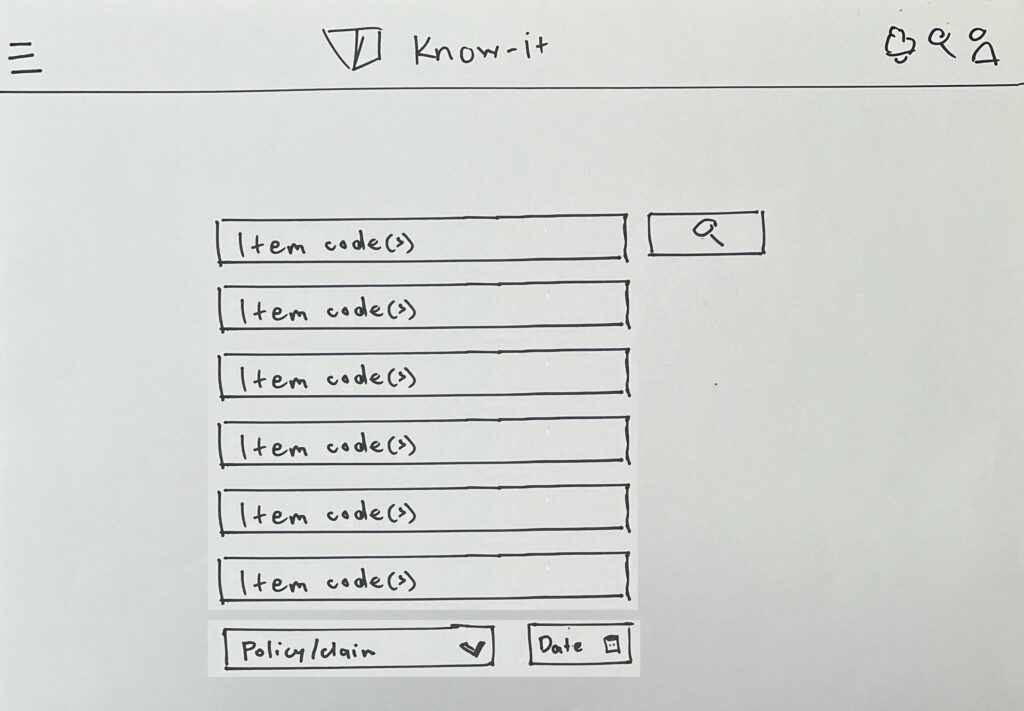
We then decided to do some rapid lo-fi prototypes and test them with 6 users via Microsoft Teams. These drawings were then imported to Figma and made into interactive prototypes.
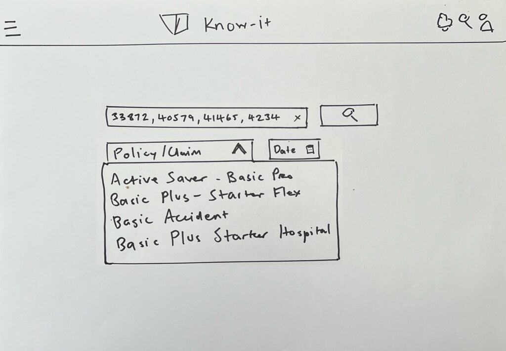
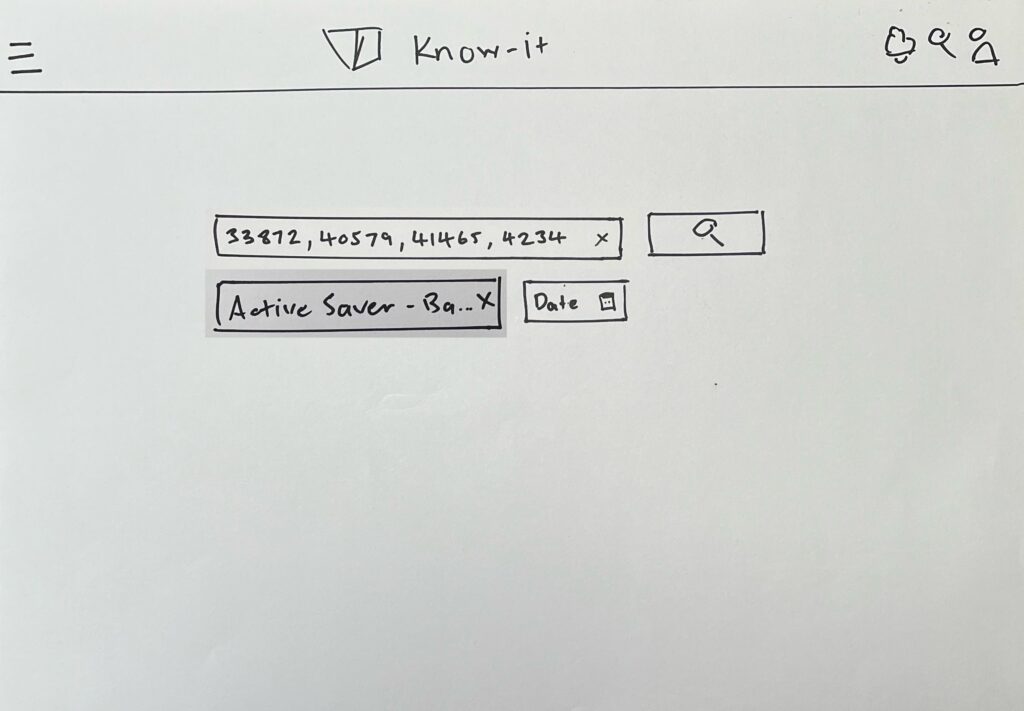
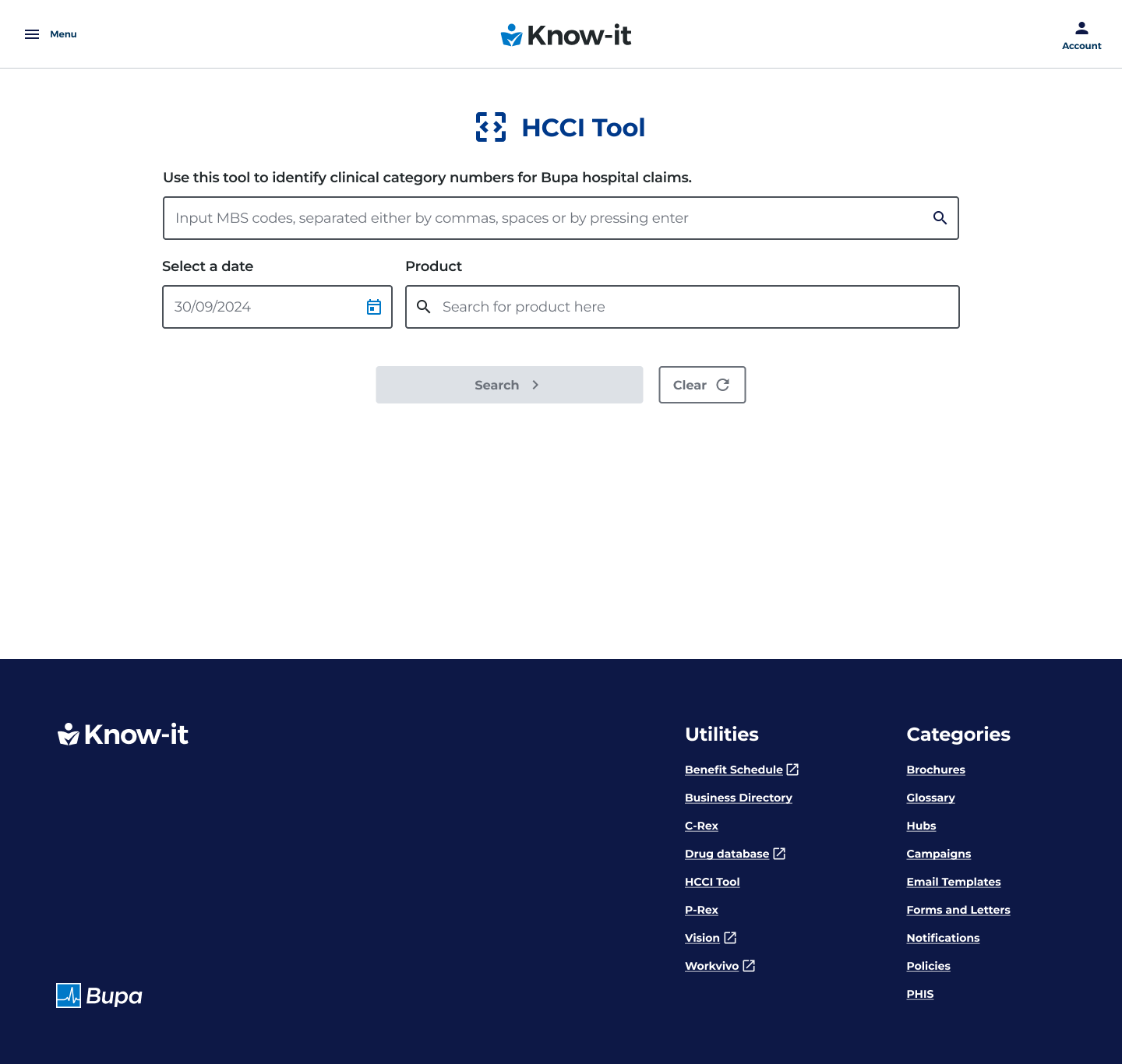
These prototypes were initially set up as a single page design with multiple input fields. These were text input fields for the item numbers, a product field (which was the customer’s selected product) and a date picker. Once the user entered the data, they would then select a submit button which would then show the entered claim item’s matching clinical category and if those claim items where covered within the customers current health cover.
There task for the lo-fi prototype was to enter four numbers and search for their eligibility.
Lo-fi prototype – Usability test
Findings
We found a strong and positive response from our users in how this feature would save them time and effort in processing claims in their working day. They felt that the self serve option of entering item numbers would create more efficiencies and enable an increase in assessing claims.
We found that users where in 2 buckets.
– The first were front line staff who exclusively dealt with one type of code, MBS.
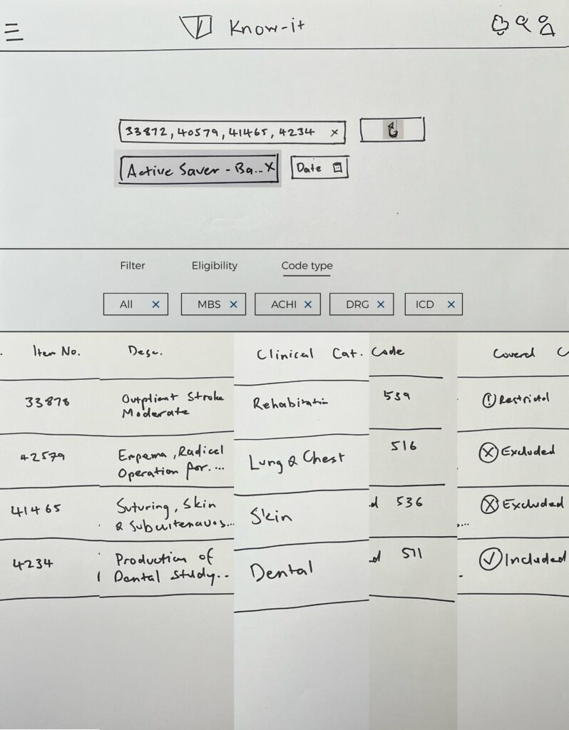
– The second were Claim Assessors who dealt with multiple code types – MBS, ACHI, ICD and DRG.
Our users also said said that it would be handy if there was a way of transferring this data to email format as they usually have to email this data, so for the hi-fi prototypes we decided that we would implement a copy to clipboard feature.
Feedback changes from the lo-fi prototype that where made prior to the hi-fi prototype stage
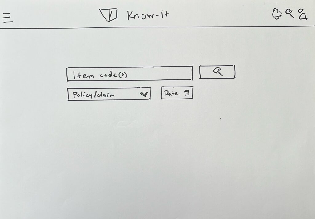
- One input line
Early in the process we found that users tended to generally get 4-6 claim items per claim. At most there would be edge cases of 10-12 items within a claim but these instances were rare, so we pivoted to a single input field that would house multiple claim numbers. - Filtering
Users said that due to the small number of claim items per claim, that the filtering option was not necessary. - Sharing results data
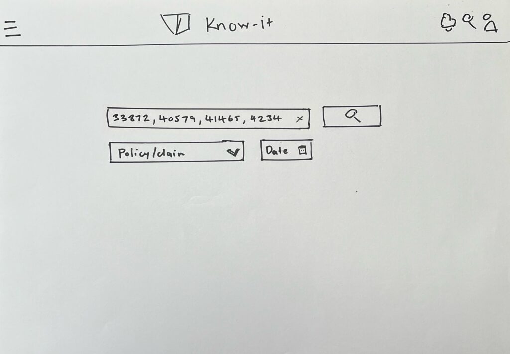
Our users also said said that it would be handy if there was a way of transferring this data to email format as they usually have to email this data, so for the hi-fi prototypes we decided that we would implement a copy to clipboard feature. - Finding entered numbers
Many users mentioned that they had some trouble distinguishing the number that they entered, so improving the eligibility in this area was crucial.
Hi-fi prototypes
I designed a hi-fi interactive prototype and tested it with 5 claims assessor level users with the same task as the previous lo-fi prototype, in that the users had to input 4 claim numbers.
The reason that I mainly chose claims assessors for the final usability tests was that they dealt with all four code types.
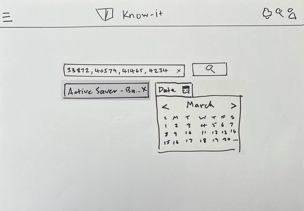
Landing Page
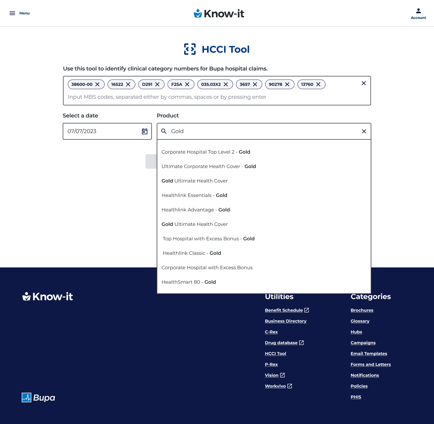
Suggestive search for customer’s product
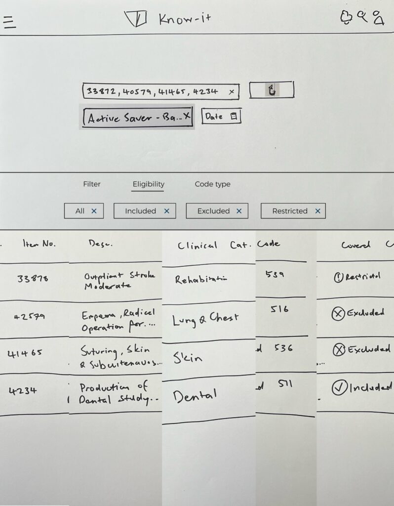
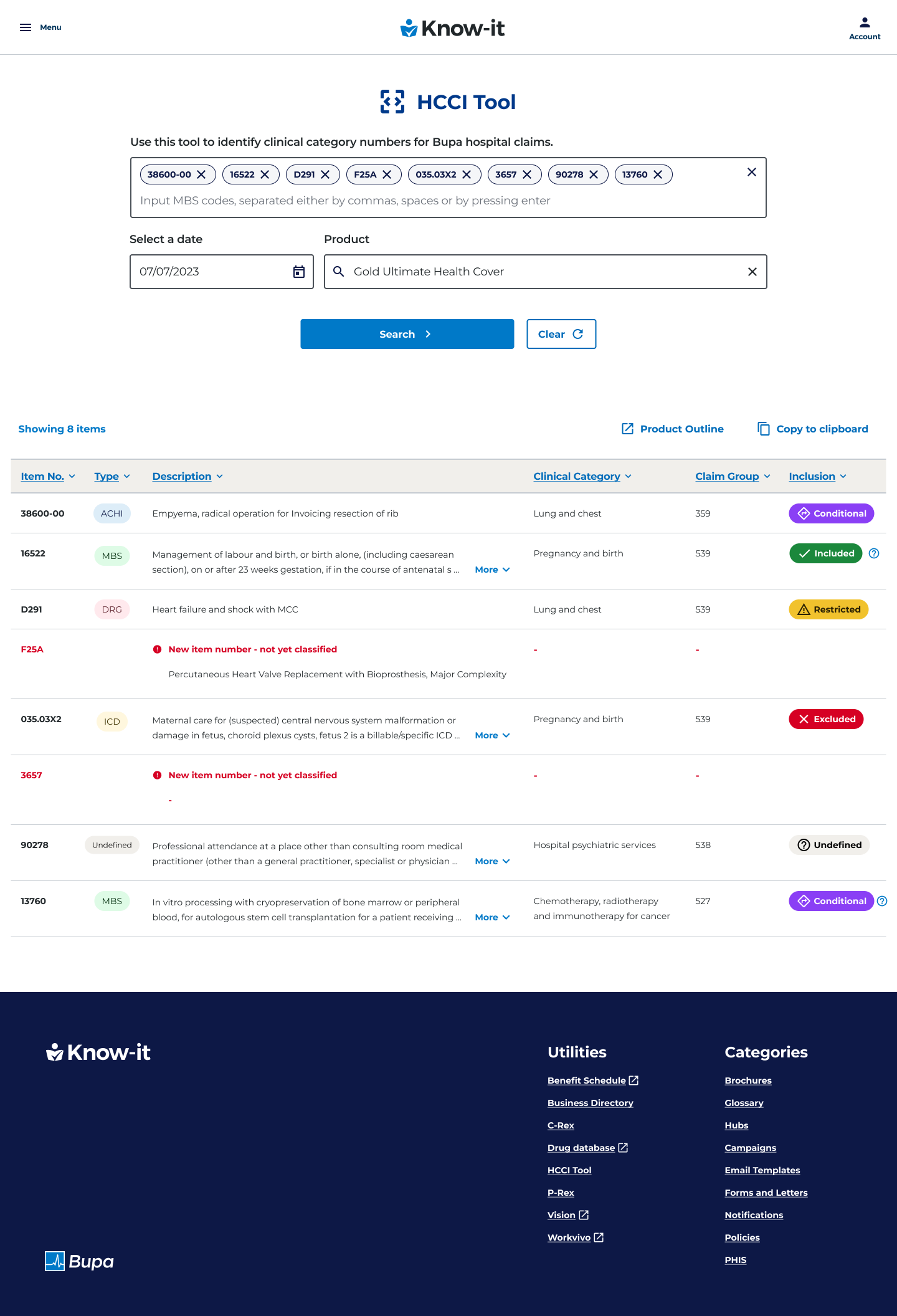
Results page
Issues and challenges
Lengthy descriptions
At the hi-fi wireframe design stage, the data team had informed us that some claim item descriptions had 1000+ characters that needed to be displayed due to regulatory reasons. As a workaround we implemented an accordion deisgn feature, which would expand and contract the selected row so users could see the full description text.
Accordion design feature
Originally we had the row expansion feature at the far right of the claim item row, however most users could not find this feature in the usability test, so we pivoted to placing the expansion and contraction chevrons within the description text itself, which users found easier to find.
Tech feasibilty
For the most part the development team had no issues with the UX requirements. The only design component that required a change was the datepicker feature. This was not possible for delivery due the tight delivery timeframe and a clash with other Javascript features on the page. As a work around we implemented a text field which was pre-populated with the current date.
Design system
Bupa was going through a rebrand of its design system which also required a re-design of the KNow-it platform itself, so after the code mapping tool had launched, I had to rebrand the feature with the updated design system components.
Learning and lessons
In retrospect, I probably would have looked at the typical claim item numbers entered per user more closely at the interview stage, as this would have saved some time at the wireframe and prototype stages.
I also would have made time for some tech feasibility discussions around the data that had to be surfaced much earlier in the process, given the importance of the regulatory requirements of some of that data. This was the case with the lengthy data description field as this was quiet a complex design component to implement.
Conclusion
Users found that the claims process was much more simplified and efficient due to the code mapping tool being located in one area, with a much higher degree fo accuracy than the previous method of undertaking a process of elimination by searching through multiple pages for a single claim item, with no guarantee of a correct result.
By having a dedicated self serve tool, the users had more confidence in the results that where entered, as this data was not scattered across numerous pages of Know-it which required lengthy crosss referencing.
Users Claim times went from a 30-45 minute process time (for the worst case scenario) to an average of 10 minutes maximum process time..
40%
Projected increase on claims processed claims
$12k
Resulting on a saving per week per consultant
35 mins
Reduction of maximum claim process time per session