Product recommendation tool UI uplift (P-Rex)
Uplifting the P-Rex user experience for Bupa ANZ’s Cover Fit Team, to enable them to help existing Bupa members chose a new health plan.
12/08/2024 – 8 minute read
The challenge
The problem and scenario
Know-it is Bupa ANZ’s established and trusted product and policy knowledge-base that is dedicated only to it’s front line staff, which they use while they are assisting customers with their enquiries.
However, when it comes to existing customers who want to evaluate their current health plan and explore other Bupa products that they can switch to, the current product recommendation tool does not always meet Bupa’s Cover Fit team’s expectations.
The solution
We set out to uplift the user experience of P-Rex, Bupa’s internal product recommendation tool, by designing an updated UI. We started by gathering user feedback about the current state and entered the design stage with the intention of leveraging Bupa’s recently updated Rhythm Design System components to uplift the UI and UX of P-Rex.
My Role
As the Senior UX Designer of the Smart Response team, I led the research and visual design phases of this project and worked closely with our Product Manager, Business Analyst, Smart Response’s development team and the Cover Fit team leaders and consultants.

“…I’m getting lost in the selection process, sometimes it is easier to consult the print brochure”
“It doesn’t fit the conversation…”
IRIS , Cover Fit team member
TL;DR Version / Summary
Problem:
Bupa’ s Cover Fit team members need a more efficient and flexible way of searching for a new health plan for existing customers
Solution:
Design an updated UI for the P-Rex tool to help Cover Fit members find better cover for their customers
Tasks:
User interviews & summary report
Usability tests
Lo-fi wireframes
Hi-fi interactive prototype
Outcome:
10% projected daily decrease in AHT (average handling times) for Cover Fit consultations, which would save $2000 per agent per week.
Project context and opportunities for uplift
The current state of P-Rex: Observations
P-Rex is used by many areas across Bupa front line teams, however the largest concentration of users was within the Cover Fit team.
The Cover Fit team are responsible for working with existing Bupa members to assess their current level of cover and recommend a change of cover depending on their circumstance.
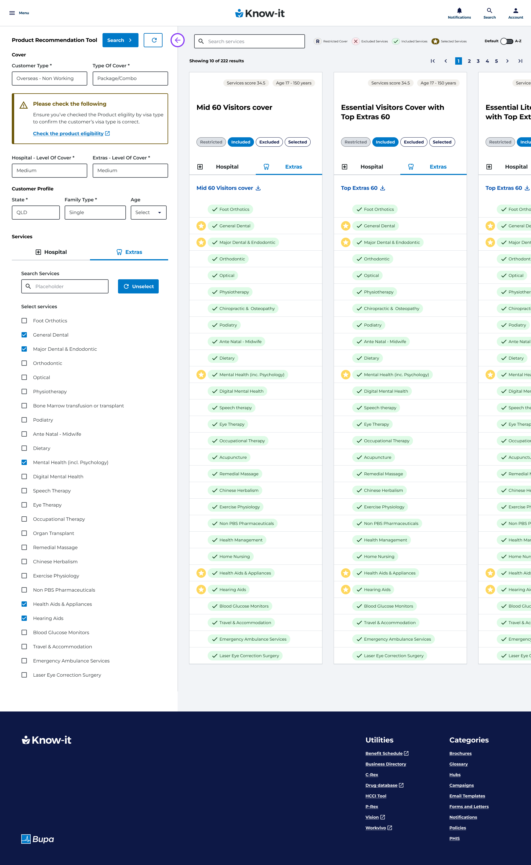
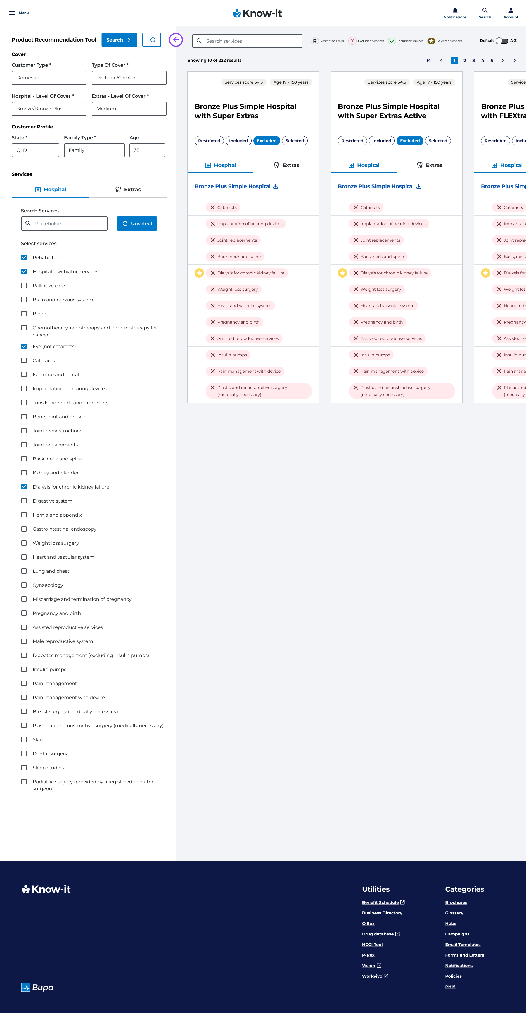
P-Rex is the primary tool used for this process, as it lists the member’s level of cover (ie their selected product and it’s product items) to other Bupa health care plans that they may would like to upgrade or downgrade to.
Rhythm
During the time of this re-design, Bupa had recently updated Rhythm Design System components and this presented an ideal opportunity for an update in the UI of P-Rex.
One of main drivers of the design system being updated and implemented was accessibility and this certainly was an issue with P-Rex , namely the lack of contrast and readability in certain parts of the design that was not compliant with WCAG standards.
Summary
Overall, as the project’s UX Designer, I felt that the there were too many areas on the current state of P-Rex that weren’t useful to the design. As page real estate was scarce due to the large amounts of data displayed, I wanted to improve the UI by making more efficiencies with the space in the design.
Main focus areas of uplift
Filter:
Making this area more compact and the service areas data more reflective of the filter options that have been selected..
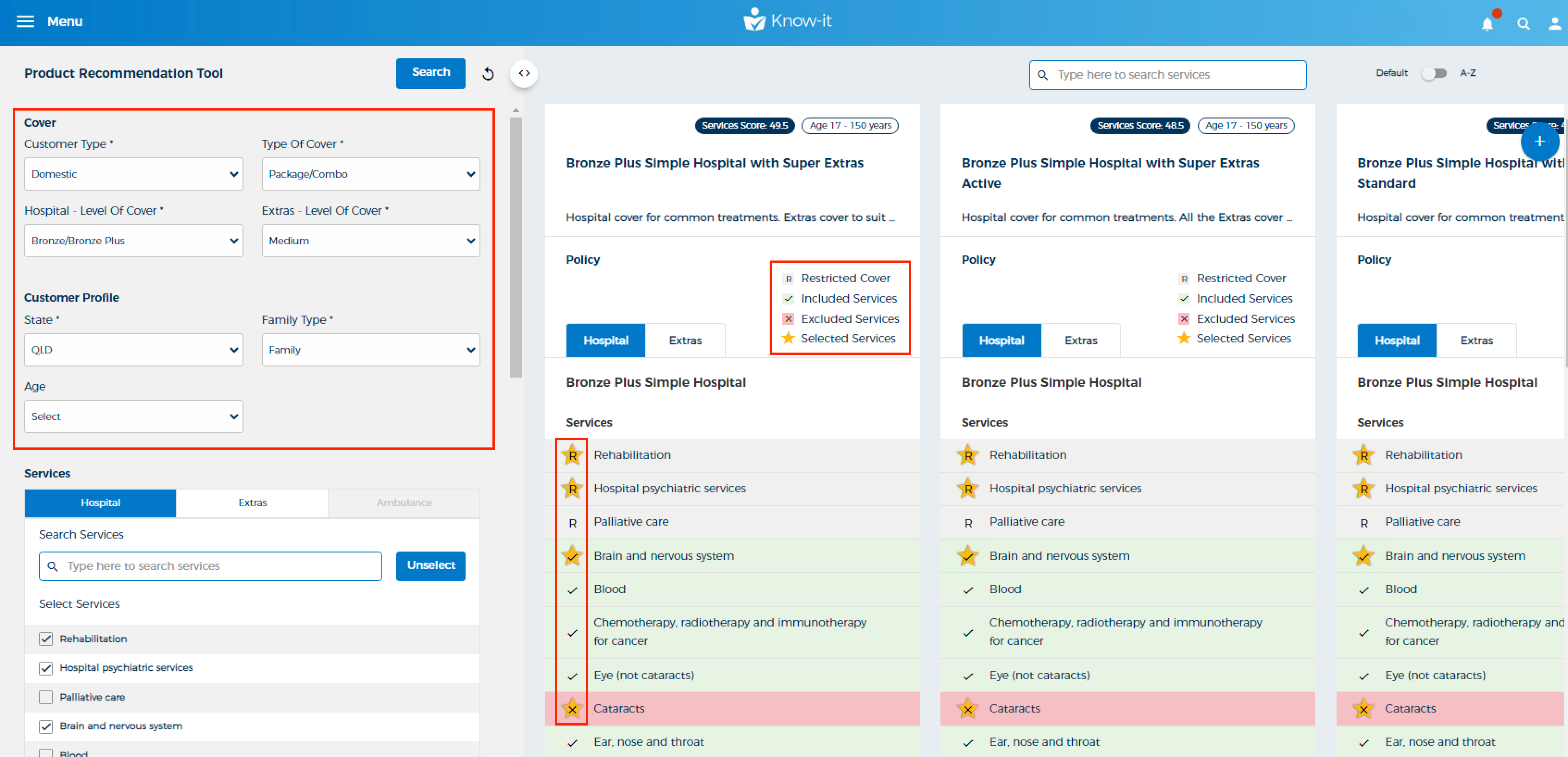
Services key:
The area within the result cards is not really serving any purpose or function and is taking up space. Because these items are repeating in each card it is taking up a lot of real estate on the page.
Selected services:
There are clear accessibility issues due to the lack of contrast between the service list item highlight and the service list item background colour
User research
User interviews:
I conducted and led 6 interviews in Microsoft Teams with Bupa ANZ front line staff to develop a better understanding of how they currently approached the product comparison process while using Know it.
During these interviews we discussed the main pain points of using P-Rex, as well as Know-it in general.
These interviewees came from different teams across Bupa ANZ, but the main cohort came from Cover Fit. Other teams such as Retail and Messaging where also included.
Typically these users:
• Valued easy navigation and speed
• Disliked slow loading and unintuitive UI
• 66% of users had an average tenure of 6-12 months at Bupa
• 33% of users had been with Bupa for 5 years or more


User interview summary findings:
Finding the right product took effort
Users felt like there was too much effort required to find the right recommendation and it’s related product outline
Time constraints
Users didn’t always have time to compare plans (some users had time limits on their calls) and their customers may not always have time to go through their plan properly.
Ambiguity
Users found that they could get easily lost in the comparison process. 50% of users would rather refer to a PHIS pdf document of the product as it is quicker to access.
Common insights
For a lot of the consultants, P-Rex it is a good tool for product education but once they attain a certain level of knowledge, they decrease their P-Rex usage.
For occasional users, they still find P-Rex to be a useful tool when looking for cover updates, confirming cover plans or a finding an out of the box cover item they were unsure of.
Many users also stated that they could not get Corporate customer information, so they’d run a domestic product search with similar settings to guess the equivalent cover. This scenario was time consuming, inaccurate and a risk to the business.
A majority of users also required access to PHIS (Private Health Information Statement) documents of the product once they had made their product choice. A PHIS document has be referenced and confirmed by the Cover Fit team member before they change the customer’s cover.
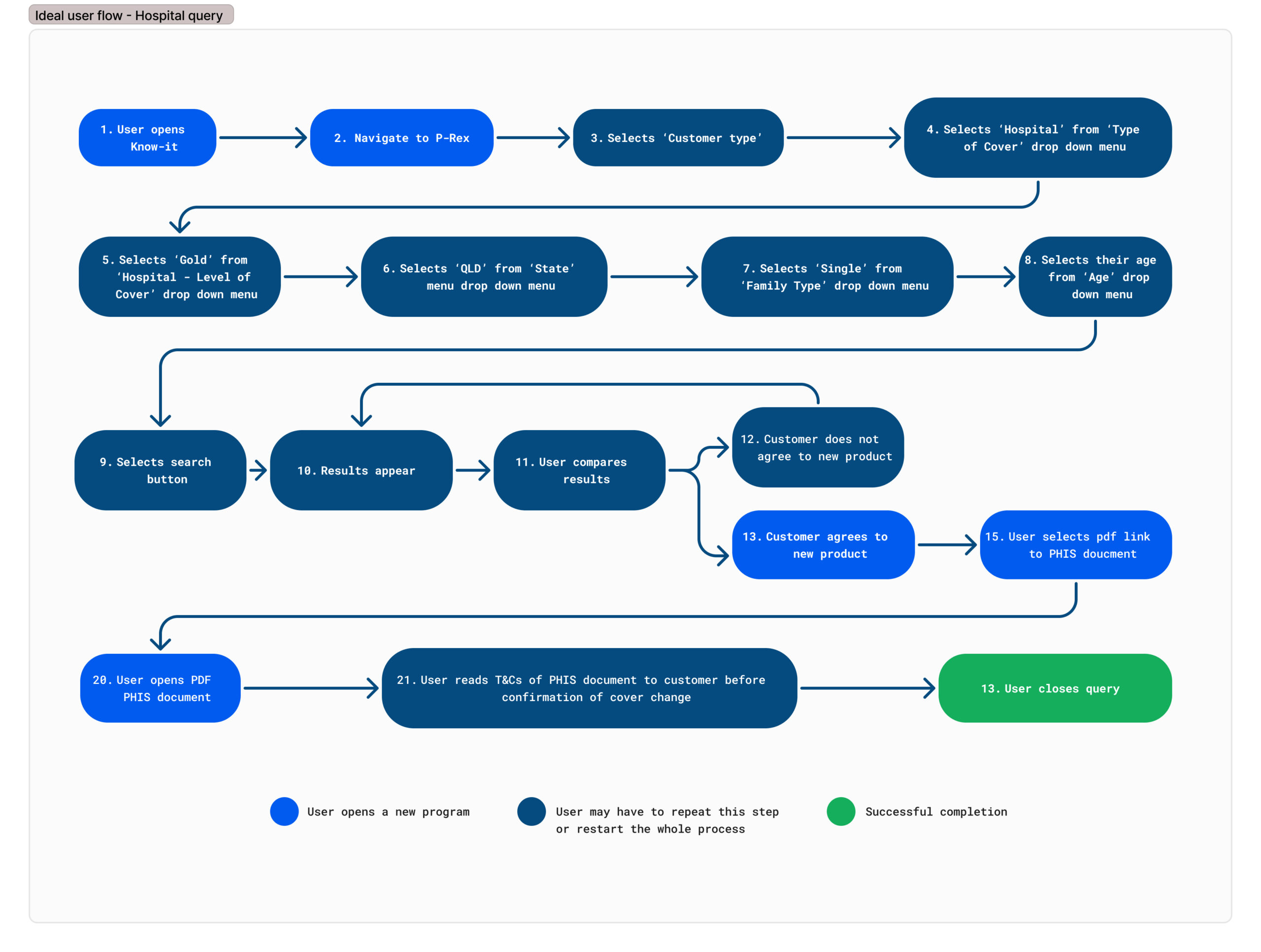
User flows
The feedback that we received in the interview process was that for the most part, the tool mostly worked for our users, however we wanted to evaluate any opportunities for improvement.
So the best way for us to start was to analyse the current state user flow.
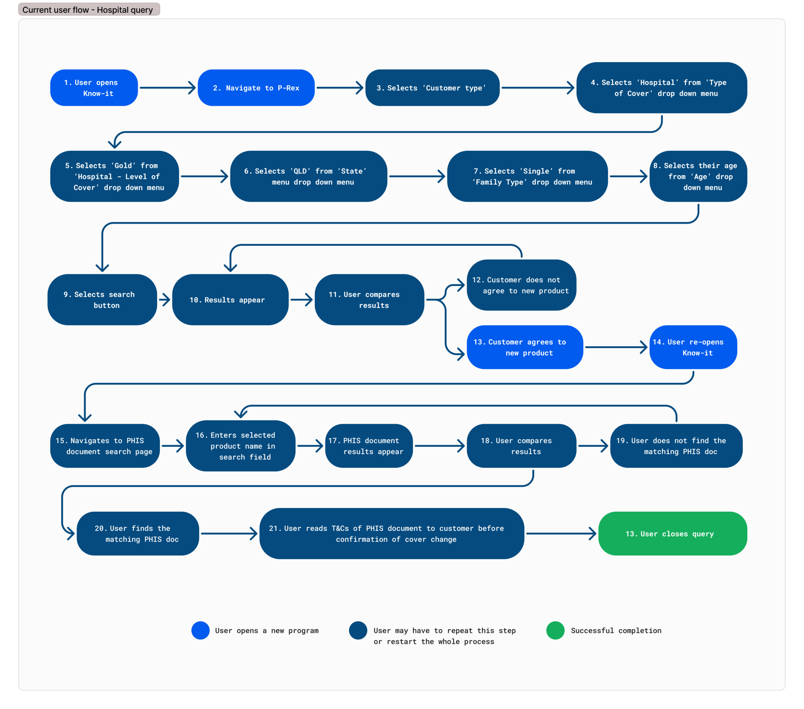
This process was straightforward for most users in terms of using the initial filters and displaying the results from these settings, however in terms of getting the related PHIS document of the product tile, it was a pretty cumbersome process that we believed could be resolved by placing a direct link to the PHIS document within the tile.
Recommendations for a future state user flow:
After my interview findings, I recommended that updated product recommendation tool would have the following improvements
- Links to PHIS document, product outline and ‘Find a Provider’
Our users said that finding an associated PHIS document from a product tile was time consuming, so we consulted the data team to see if a direct link to this document form the tile was possible and they had confirmed that this was technically feasible.
During this session with the PM and the dev team, the idea was floated by the business that it may be beneficial to provide a ‘Find a Provider’ and ‘Product Outline’ link, so we decided to test this assumption with users in the lo-fi wireframe stage. - Corporate products
After consulting with the PM and data team, they confirmed that this data could be surfaced in the tool.
Design stage
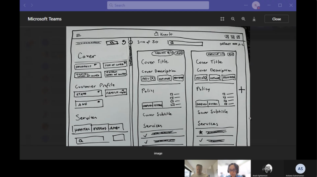
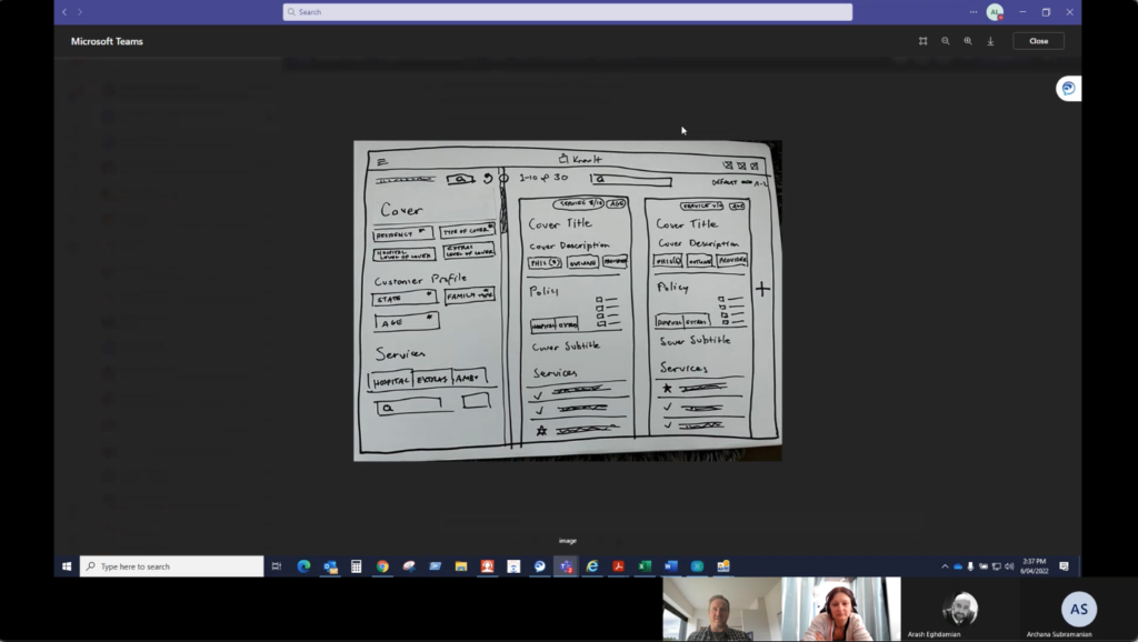
Lo-fi prototypes
We then decided to do some rapid lo-fi prototypes and test them with 6 Cover Fit users via Microsoft Teams.
We then gave the users the following tasks:
- Conduct a product search in current and future state lo fi
- Start and describe a “Corporate” product search and the expected steps
- Locate a product’s ‘PHIS document’ link and talk us through the expected steps to retrieve that data
- Locate a product’s ‘Product outline’ and talk us through the expected steps to retrieve that data
- Locate a “Find a provider’ link and talk us through the expected steps to retrieve that data
- Conduct a search, locate the product tile search results and find a new product with ‘physio therapy’ and ‘chiro’
Lo-fi prototype – Usability test
Findings
We found a positive response from our users in how this feature would save them time and provide more flexibility in their search for finding products to recommend to their customers.
Link to PHIS documents:
66% of users said this feature alone would save them 3-5 minutes in time per product , rather than searching manually for the products related PHIS docs
Corporate Products included in the Level of Cover drop down:
33% of users said that this was a top priority. This is a quick win as from the UI point of view, it only needs to be added into the drop down menu.
Product outline and Find a Provider link:
The majority of users either didn’t see value in these features or ranked them as a low priority.
Feedback changes from the lo-fi prototype that where made prior to the hi-fi prototype stage
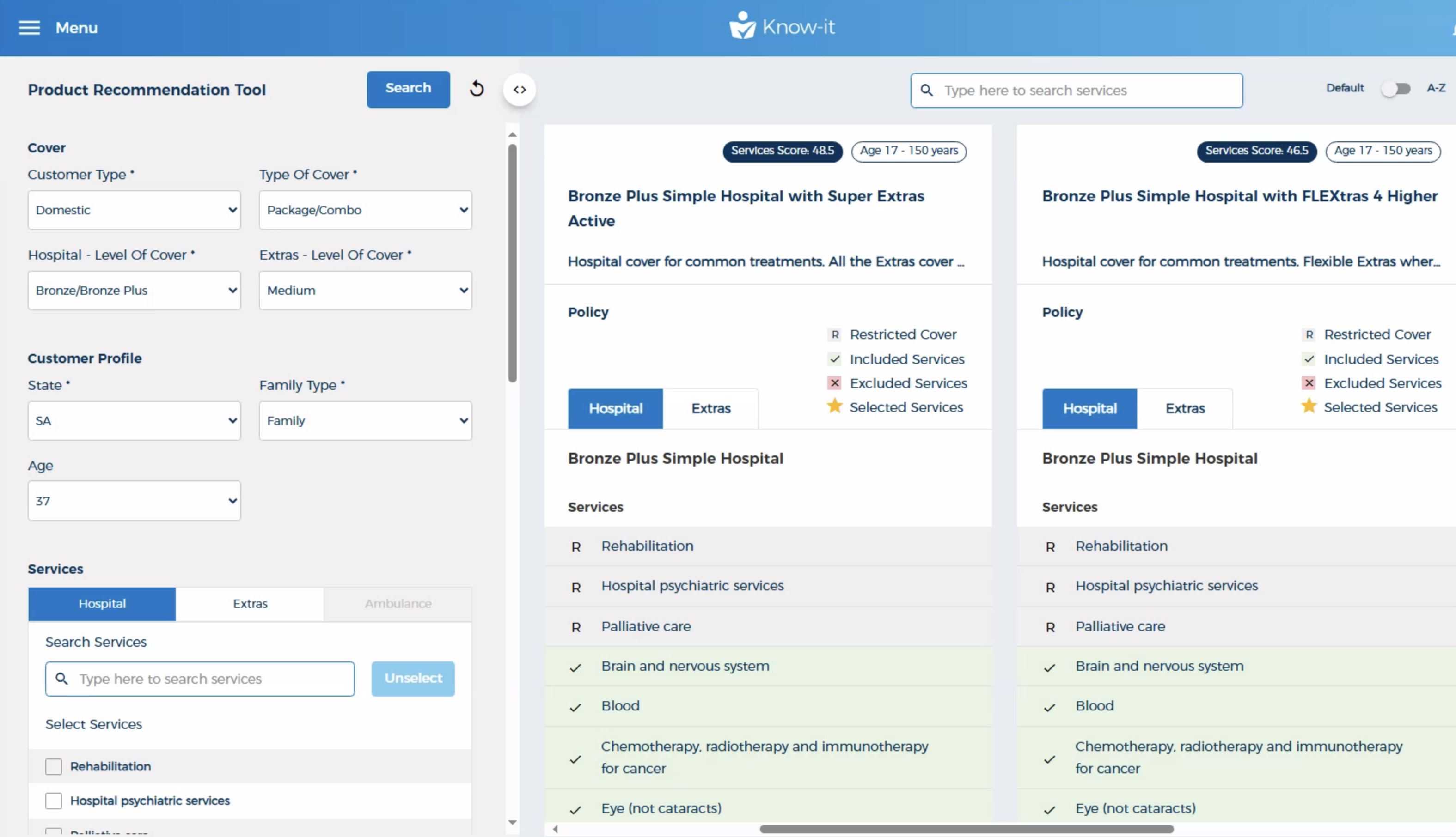
- Filtering from within the product tile
I believed that filtering would greatly enhance the UX of the page in terms of helping the user refine the search and added this to the hi fi prototype. This feature would enable more space on the page for other pieces of product information. - Links
From the lo-fi prototype design, I only left the PHIS document link in the hi-fi prototype and left out the product outline and find a provider link as the users felt that there was little value in the latter two. - Product description
When asked about these in the user interviews , most users indicated that this data was not of use, however the business stated that this text was necessary for regulatory reasons. To work around this, I decided that the Policy title area would =not just show the title of the selected product, but also contain a link to it’s respective PHIS document, which would contain the product description and therefore comply to regulatory requirements.
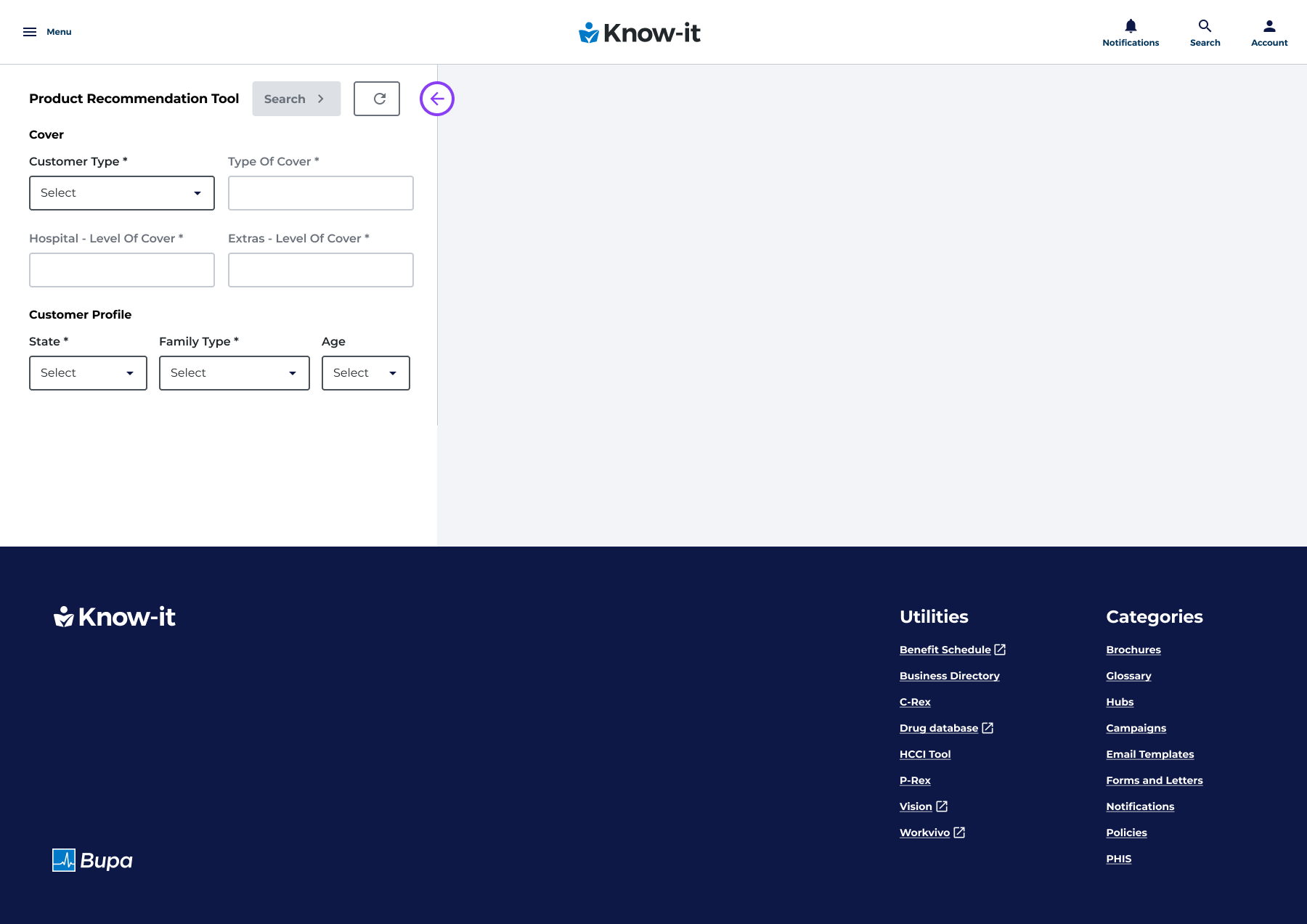
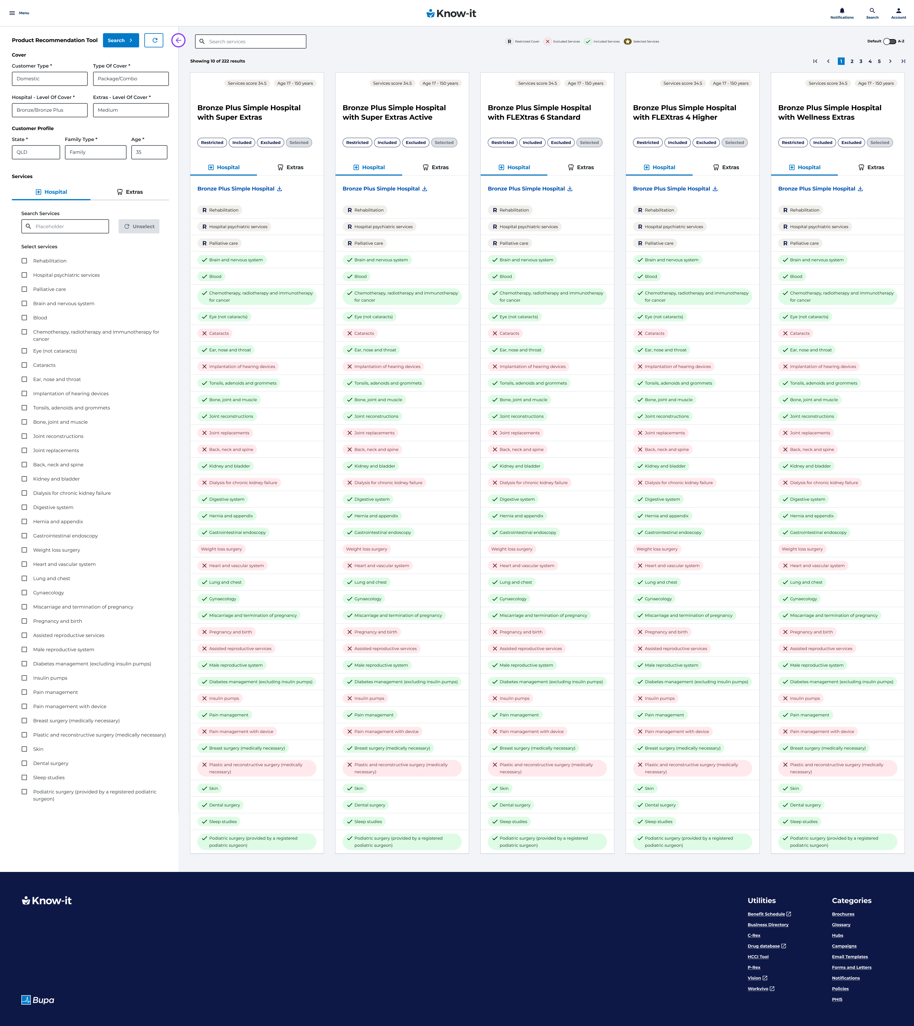
Hi-fi prototypes
I designed a hi-fi interactive prototype and tested it with 4 Cover Fit level users with a similar task list as the previous lo-fi prototype:
- Conduct a product search in future state hi-fi prototype
- Start and describe a “Corporate” product search and the expected steps to find this drop down
- Locate a product’s PHIS doc and the expected steps to retrieve this data
- Conduct a search, locate the product tile search results and find a new product with ‘physio therapy’ and ‘chiro’
Landing Page with no filters selected
Product tile results – Hospital and Extras (zoomed out)
Product tile results – Overseas non working Hospital and Extras query with ‘Included’ filter, selected services and warning prompt
Results page – Hospital and Extras query with selected services and ‘Excluded’ filter selected
Issues and challenges
Pricing
My initial lo-fi design included a monthly price on each product tile. Unfortunately this was not technically feasible at the time of the launch as it would have been too high of a scope in terms of development. Fortunately the Cover Fit users found that while the launched tool didn’t have the real time costs displayed, the linking of the PHIS document from the product tile helped shorten the search time for finding the cost to the customer.
Design system
Bupa’s rebrand of its design system was being rolled out while this tool was being designed. In a few cases, I had designed components for this tool which Rhythm had eventually designed which had resulted in the design having to retrofit the custom components back to the Rhythm versions once they had launched.
Learning and lessons
In retrospect, I probably would have had more discussions with the Rhythm team in regards to the roll out schedule of it’s design system components so I could have saved time from duplicating efforts in designing the Figma components.
I would have also made more time early on in the process for some tech feasibility discussions around the pricing data so that I could have made some UI adjustments around this, as pricing was a main pain point of users.
Conclusion
Users found that the updated product recommendation process in the new P-Rex UI was much more simplified, flexible and efficient due to the reduced need of using multiple programs and requiring less steps to find the associated PHIS documents with their related product tile.
Users forecast that they would save 3-5 minute of time searching for a PHIS document from the product result card link
10%
Projected daily decrease in AHT (average handling times) for Cover Fit consultations
3-5 mins
Projected decrease in finding the PHIS document related to it’s product tile
$2k
Which would result in a $2k saving per consultant week per week